![[Top 3] FF14 Best UI Layouts final fantasy xiv, best mmorpg 2021, best mmo 2021,ffxiv UI, ffxiv UI layout,UI layout, top 3 UI layout](/sites/default/files/styles/responsive_image_600xauto/public/2021-08/screenhunter_93_01.jpg.webp?itok=Vo2mK7cT)
Final Fantasy XIV is a game that offers its players many contents, from solo content, dungeons, trials, and some savage and ultimate raids for end-game players. However, all players would desire the same thing when playing all the content the game has to offer: a UI layout suitable for them and their gameplay.
This article will help FFXIV players in looking for the best UI for their gameplay, mainly players who are looking for a clean and straightforward UI, as well as different types of UI that can help them to switch jobs easily without littering the whole screen with a thousand job icons in FFXIV.
3) Stefan Ash's UI
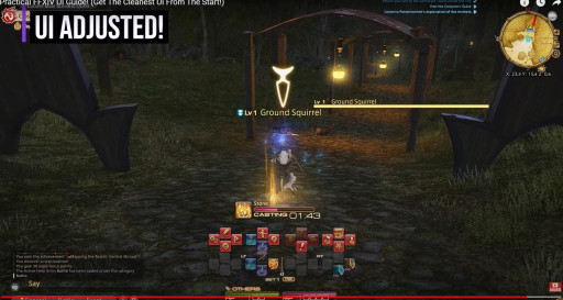
Stefan Ash is an FFXIV content creator who has uploaded several guides, mainly aimed towards new and free trial players in FFXIV. In this case, his UI is also aimed at the same audience.
It is a cleaner, clearer UI that is most suitable for new players as they do not need to do a lot of complicated changes to achieve the UI of their dreams.
In his video, Stefan emphasized highlighting the more important information by making them more prominent while making the less essential windows and elements smaller to save space.
Some of the essential elements he adjusted to being clearer are the skill bars, job gauges, monsters’ health, cast bar, and placing your buffs, debuffs, and long-term buffs next to each other for better viewing.
This UI is very suitable for new players who want to get a more detailed look at their skills and the boss’ cast bar and health, allowing them to breeze through the content in FFXIV at a more manageable pace.
2) Desperius' Clean HUD & Layout
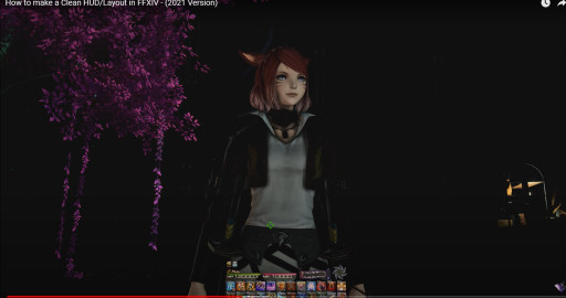
Desperius is one of the most popular FFXIV content creators out there. He has created many different guides and showcases that help FFXIV players through their journey in Eorzea, including his own HUD.
This HUD deactivates unnecessary windows, icons, and elements, making the screen look cleaner. It is a handy tool for FFXIV players who prefer a cleaner and simple HUD or FFXIV players looking into end-game raiding and want their screens to see the boss’ mechanics.
In his video, Desperius explains how he can turn on and off the unnecessary elements using a macro that can be set up in-game, as well as some other visual adjustments that a player can adjust to their tastes, like party member list, minimap, experience bar, and so on and other windows.
1) Zepla's UI Setup
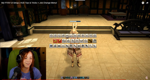
Zepla’s UI setup is unique as she also takes inspiration from a Reddit post about one of the ways to create a simple UI that helps make it much cleaner and more effective to change jobs in the game.
As FFXIV is a game that allows its players to be able to change jobs easily as equipping different weapons related to said jobs, players who have dabbled in a little bit of everything tend to have their screen full of cluttered job icons, which allow them to change their jobs easily using a macro.
Through the help of said Reddit post, Zepla explains how to make a different UI for changing your jobs in the game quickly and how to create the necessary macros in-game. This is a beneficial tip for players who have unlocked jobs or even players with more than enough job icons on their screen.
Zepla explains in her video how to make a clean UI that accentuates the vital information when doing dungeons and even raiding, such as boss’ castbar, your hitbox and debuffs, and much more. She also added some options about where to put the minimap, quest bars, and other game elements.
You May Also Be Interested In:
- Top Five Best FF14 Solo Classes
- FF14 Best Class - What's the Best Job to Play?
- FF14 Top Three Tanks
- FF14 Best Healer - What's the Best Job For Healing?
- [Top 15] FF14 Best Addons Everyone Should Use
- FF14 Best Ways To Make Gil (Top 10 Methods)
- FF14 Best PvP Class That Are OP
- FF14 Best Potions And How To Get Them
- FF14 Best Ways To Level Up Fast
- [Top 3] FF14 Best DPS Class
- [Top 3] FF14 Best Starting Classes for Beginners
- FF14 Most Fun Classes (Top 3)
- [Top 3] FF14 Best Crafting Class And Why They're Great
- FF14 Best Dungeons [Top 10]
- FF14 Best Tanks (All Tanks Ranked Good To Best)
- [Top 10] FF14 Best Armor Sets
- [Top 10] FF14 Best Food And How To Get Them
- Top 10 Best FF14 Mounts And How To Get Them
- [Top 5] Final Fantasy 14 Best Solo Classes
