Hello, my fellow moonies; we are back with even more information you can spread to your friends and family about Sailor Moon's artwork, one of the best parts of the Sailor Moon story. For me, comic books are the original picture book even if they weren't always for kids under 10 years old, everyone had one.
The artist had already put her talents to the test when she had created other series that already became popular. Color can really make a difference in a picture but, with most of the comic books being black and white and you can still feel the Sailor Senshi's energy leap from the pages. I love color pictures but black and white is really where it is at, and packed with so much detail. Reading the mangas can almost be as intense as watching the anime, some scenes could be so graphic from a simple word like "stab" being stapled across the page. The turning in your stomach as you read that another enemy as cut someone down. In the manga, things like different attacks or fight scenes, and even characters were sometimes changed or tailored for a younger audience.
Besides taking in these beautiful pieces of artwork, was hearing how each picture came to be. Whether it was taken from a movie like Mission Impossible, it was taken from a high fashion runway show or the artist's favorite interest its crazy to believe human hands can posses such talent.
15. Sailor Attack Powers
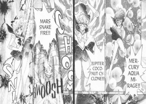
This is a mash-up of powers and moves we may not see unless we read the manga, some of these aren't even used.
Manga represents Japanese comic books and graphic novels generally aimed at adults and children. Sailor Moon became Naoko Takeuchi's most well-known manga series of pretty much all time. She then started her series "The Cherry Project," "Codename: Sailor V," and "Pretty Soldier Sailor Moon" became some of her most popular mangas. Since the mangas are the actual storyline, we see more characters, an alternate scene from the ones in the anime, and even more attacks. Some attacks may only be in the manga, which could be why it seems some characters do not have many attacks in the first place. Most importantly, we get to know the artist bringing their characters to life in their eyes and how they pictured their characters.
What makes the "Sailor Attacks" the best artwork
-
With details that fill up the pages, they have dawned traditional Japanese style sketching that really brings it all together.
-
I feel the Soldiers are more cutthroat in these pictures, which shows they are more than just girls in a cute outfit.
14. Princess Kakyuu is Sailor Kinmoku
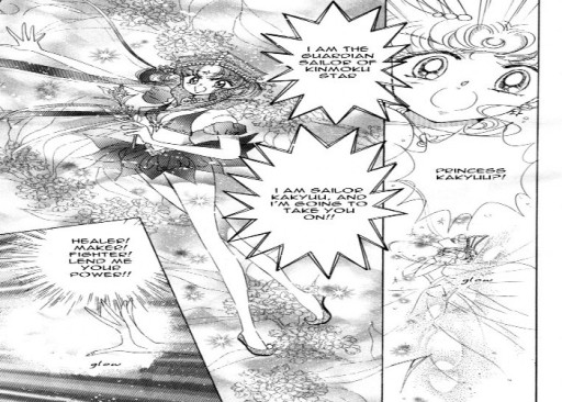
Even though Princess Kakyuu graces us with her amazing entrance and great final blow, it is all cut short when she is killed.
What I love about the manga artwork is you get to see things you may never actually see. Princess Kakyuu transformed once, and only once before she was taken out by Sailor Chi. Of course, it was after a grand attack and was caught from behind by another character. It's almost hard for me to look at these graphic novels and comprehend that human hands did these.
What makes "Sailor Kinmoku" the best artwork
-
This scene is only in the mangas, and we witness her transform and whoop butt.
-
Her name stayed the same in the anime, manga, and the musical.
-
Most of the pictures are black and white; there is so much detail and feeling in the artwork.
13) Sailor Venus takes out Queen Beryl
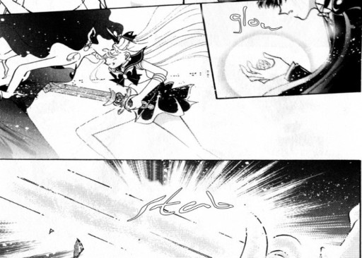
One of the bigger turning points of the series and it was rewritten completely.
Compared to the anime, the scene was changed a lot. I wanted to add it because I felt it was a great moment in the manga that changed the tone of the story, and changed how we look at our characters. Usagi is the hero which isn't bad considering she is the princess, but Sailor Venus is supposed to protect her, and she did just that. When I looked up the scenes, they were in Japanse, so just looking at the pictures was enough for me to almost here the "stabbing" of the sword. Watching Venus strike her down and see the life and the sense of "do-my-duty" was just expelled through the pages.
What makes "Sailor Venus takes out Queen Beryl" the best artwork
-
This scene was never in the anime.
-
This scene is more about purpose than style, this held meaning, and if you think about this happening and about Usagi saving them, then it fits more, like payback.
12) The Amazon Quartet
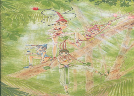
Even though these girls are mostly seen sleeping in the anime, in the manga we get to see them literally take flight and show us what they can do to help the Sailor Senshi.
These girls are the future Sailor Senshi to Sailor Chibi Moon, from the beginning(in the manga), they are present with the Dead Moon Circus' and trying to attack the Sailor Senshi from the start. The girls look fun and carefree, but they are mighty and got a mean streak. It is never really explained how they become future soldiers working with Chibi Moon or why it is never the right time for them to make an appearance. For characters with such unique looks and personalities and soon-to-be, would-be essential characters, we never got that far.
What makes the "Amazon Quartet" the best artwork
-
Naoka comments that she enjoyed creating them and their fun hairstyles and that they were very active characters.
-
They are said to be in the "Amazon" sleeping and then woken by Queen Nehelnia. I love the setting she chose of them being in the forest and looking agile, vibrant, and ready for business; I feel I can see why they become future Sailor Senshi.
-
These characters and a few others are the only ones to be called Sailor Senshi, be villans and come back from it.
11) Blue Moon
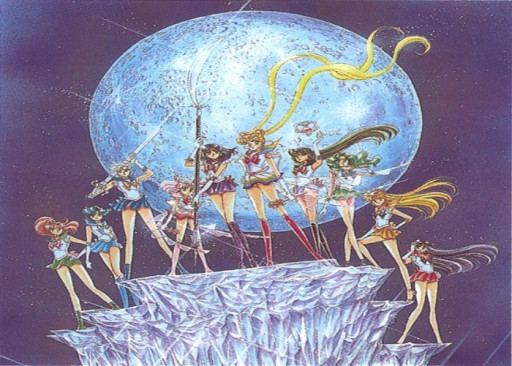
We have the whole Inner and outer Sailor Senshi banded together for one more final stand.
When I look at this picture, it makes me feel like I am stating at "Superman" or "Batman" standing at the edge of the world or the city, looking down upon it, protecting it. She drew her inspiration from something else she had come across that had a dinosaur in it. It was titled "see all the sailor soldiers here."
What makes "Blue Moon" the best artwork
-
This picture gives them that hero stance feel, which I like; every hero has that look.
-
I love the strong will the painting gives off, the characters standing on an ice structure, not too heavy to break it yet just right.
10) Sailor Pluto
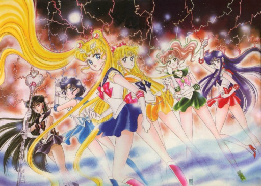
Even though this is a sample piece for the editors to show the contrast between Sailor Pluto and the other girls it is a great simple poster piece as well.
This picture was created as a battle cry when they met with Sailor Pluto during the manga; I have to say I can feel the power within, everyone all geared up and ready to take on the evil. During the crafting of the Sailor Senshi, Pluto was made to-be as a darker-skinned character. In many manga pictures, you can see the difference; I think this picture shows a great comparison.
What makes "Sailor Pluto" the best artwork
-
December Issue title page, "The year of 1993 started with Sailor Moon and ends with Sailor Moon".
-
This was a sample piece so that production could see the difference in Pluto's skin tone.
9) "Sailor Moon pin-up"
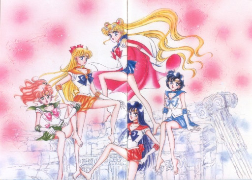
This was an idea that never took flight, but you can only imagine if it had how comical it could be.
This is an excellent picture if you have a foot fetish; issue reserved for Famicom that she says she will never do. She was determined to do them all barefoot, though. I like this because it is so fun and carefree; the fact that it is a pin-up part of the issue lets you know it is only a start to what you can see.
What makes "Sailor pin-up" the best artwork
-
It is not a traditional pin-up, but it does embody the rumors that were stirring in the first series about a cape crusader.
-
I love how the spread is big and covers to pages; I have also noticed that when they get together, her backgrounds resemble them being back at home in the Moon Kingdom around broken runes.
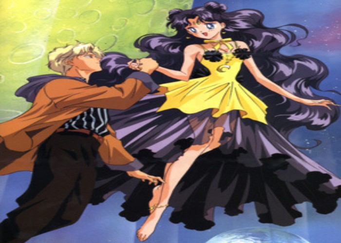
8) "Sailor Senshi Court"
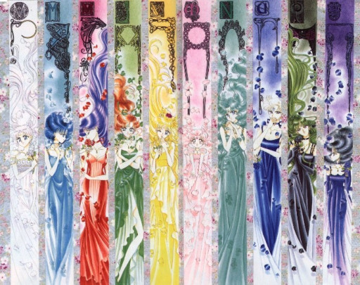
Like we are walking into a ballroom about to have our first dance of the night, the Princesses of the planets.
With all the Princesses, Princes, Queens, and only one King, you have to have your Sailor court, Unlike the movie "The Great," I am sure they just tell Usagi everything to her face instead of sugar-coating it. What I love most about this is we get glimpses of them in the anime and the manga about their courtships and their castles but never really see them in their full royal attire. They all have their unique look, style, and color that are all great compliments for themselves and each other. I only wish we could have seen a full-on episode of them in royal likeness from start to finish, call gowns and all.
What makes "The Sailor Court" the best artwork
-
Seeing their past lives, or their alternative lives in such elegance
-
I love seeing all the many different styles the girls have, and the details in such small panels are just fantastic.
7) "Sailor Senshi"
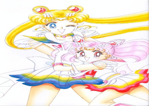
This is a great picture to show how far the girls have come to love each other and work together. Their outfits are a great yin-yang combination for their Cosmic Power transformation.
Even with their ups and downs, these two girls never let too much keep them down. Even if her daughter has to travel back in time to learn more about herself and her mom, to see that they are more alike than ever, finally, they work together great, and although these two are both opposite, they see the perspective both ways.
What makes the "Sailor Senshi" the best artwork
-
This was on the cover of Vol. 4 no. 1, a mild moment but a critical one in the story.
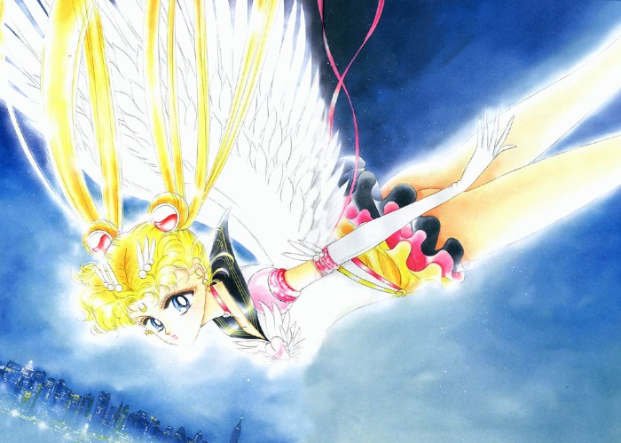
6) "Eternal Sailor Moon"
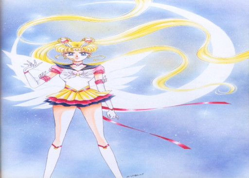
When Sailor Moon is ready for business she means business, and she is ready to throw her life on the line for her loved ones. She may cry at times but she knows when to get serious.
I love these simple sketches of our main characters, battle-ready. What I love most about them is how powerful just one simple picture can be, and what it can all capture in just this simple picture. This picture would be wrapping up the Sailor Moon series, Eternal Sailor Moon. The iconic crescent moon, rather than a full moon, is a great touch.
What makes "Eternal Sailor Moon" the best artwork
-
This was drawn to fulfill Toei's request on the character.
-
She doesn't have any of her weapons wielded, but she means business. I love how the Sailor Moon series has lovely young girls fighting crime, but they haven't lost what makes them a girlie girl.
5) "Haruka Teno"
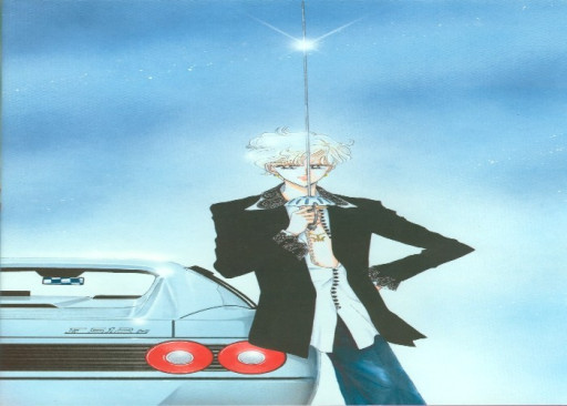
The "Ruby Rose" of the group can only have the best, which means the best fastest car too.
There are many ways to make something more personable, and the way Naoka does it is by using as many pleasant qualities. Besides using people from her own life to build her story, she even used her favorite car, Ferrari 512M. Haruka Teno or Sailor Uranus gets the chance of being the speedster and driving her favorite car.
Whats makes "Haruka Teno" the best artwork
-
She is quite something, sketched with her chest kind of out, it is crazy intense yet fits her all the way.
-
Sailor Uranus and Sailor Neptune are said to go to school using a helicopter, so for her to possess that kind of car, it is safe to say these characters are pretty loaded.
4) Maxim de Paris
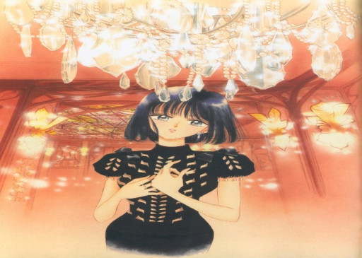
Another bold statement with a dark figure and bright background. It makes me only which we could have seen more of Sailor Saturn.
I love being able to see the characters in a real-life setting, just being the young girls they are out having dinner and hanging out with friends. I love the "simple life" look they have. This picture is of Hotaru, Sailor Saturn, the harbinger of death. In her casual look, she gives off that "goth" girl look, which fits her perfectly. The setting is a French restaurant in Shanghai. Even if Naoka couldn't remember the food, the interior of the place is an excellent fit for the look she has with Hotaru.
What makes "Maxim de Paris" the best artwork
-
I have always loved a dark object with a bright background, it allows your eyes not to mix the colors, and things do not become lost.
-
This is high contrast, and for a character, we don't see much, this is a superb depiction of her.
2) Memento mori
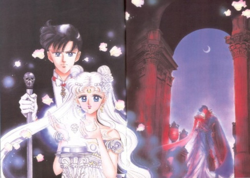
This picture gives a sense of depth when looking at death or even rebirth.
I like the manga because we get to see a different side of the characters, even a more serious side, like in this painting of the Prince Endymion and Princess Usagi back in the Moon Kingdom. The picture sores with feelings and such depth, I love the colors she picks to convey her message she does. What adds to the picture is that she has drawn Usagi with white hair, something she wanted to be added to the anime but wasn't because it lackluster, I think it would have added to the story.
What makes "Memento mori" the best artwork
-
In Latin, an expression meaning "remember you have to die."
-
I love the ying-yang feeling I get from this picture of the two kissing in the background and them in the foreground.
1) Yukata Sailor Soldiers
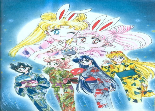
This is a fun and great picture, that helps remind us these are teenage girls just trying to live their dreams. I love when they are drawn individually like this, it really gives them so much character.
Naoka had commented that she enjoyed it when she was able to draw the soldiers in something more traditional like yukata. And I couldn't agree with her more; this picture captures a sense of culture and theories together in one image. With their bunny ears on, she refers to the rabbit on the moon, making mochi. It makes it cute when she adds her daughter and, to me, shows their softer sides towards each other. With everyone in the sky to me, it gives the impression of the girls being in the sky as well; I think altogether, it provides a great cultural feel.
What makes "Yukata Sailor Soldiers" the best artwork
-
The "rabbit making mochi on the moon" or "the rabbit living on the moon" is a story in Japan because of the moon's shadows.
-
Yukata is a casual Japanese summer kimono usually made of cotton and unlined.
-
The style of artwork is flawless when it comes to capturing these girls in their natural atmosphere.
Also be sure to read:
- [Top 10] Sailor Moon Best Episodes
- [Top 10] Sailor Moon Best Moments
- [Top 10] Sailor Moon Best Characters
- [Top 15] Sailor Moon Best Outfits
- [Top 15] Best Sailor Moon Art
-
[Top 10] Best Horror Anime with Female Leads
