Welcome to this laid-back, chill-out meeting where you and I sit and talk about cosmetics and the like. Kidding, of course. Let’s talk about HUD. No, they are not synonyms.
There is a little more to HUD than just the looks and the fancy. Let me help you through them.
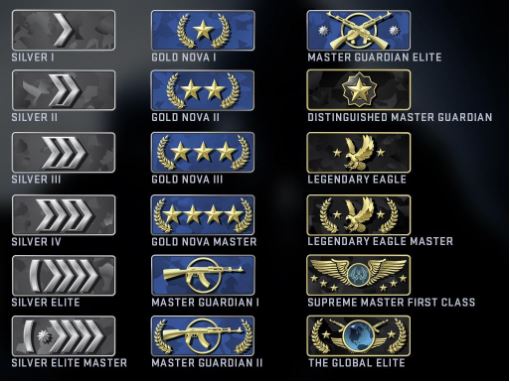
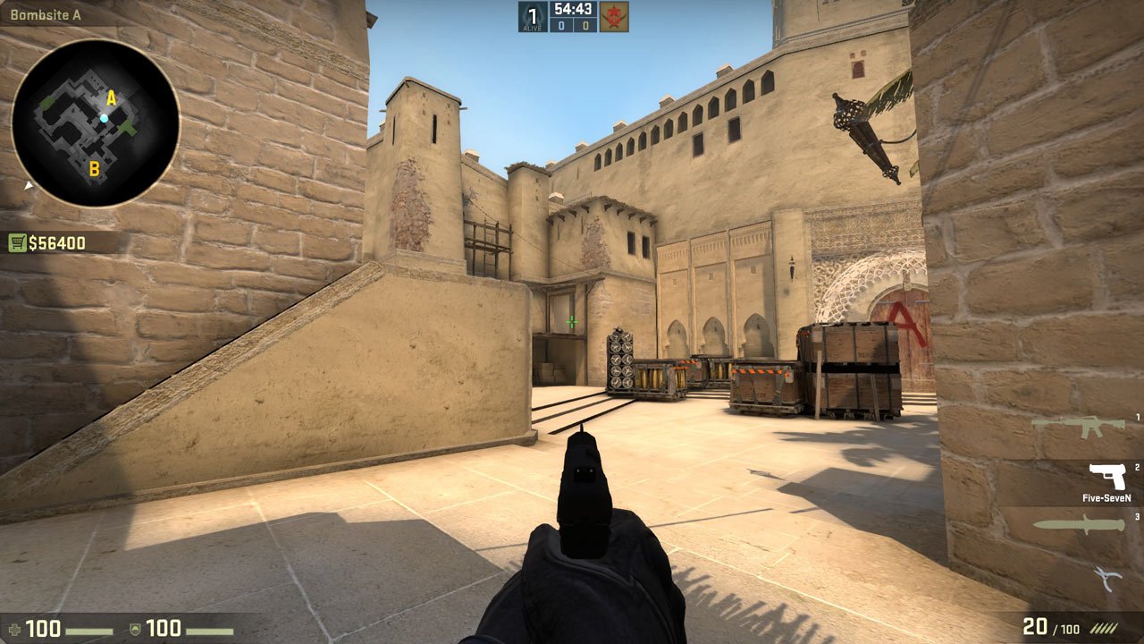
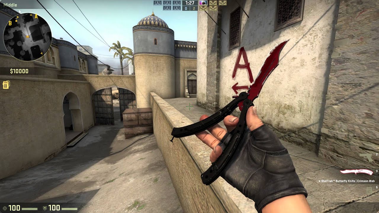
If you don’t know what HUD is, it is basically the screen that you see while playing CS:GO. The radar is part of it, but being the silver that you are, you don’t care. But hey, it’s got the weapons where you can see your cheap and ugly skins!
We’ll talk about all the elements of HUD. I’ll mention where a particular change really gives you a competitive advantage. The rest will be about the looks that you can adjust as per your taste.
10. Crosshair Settings
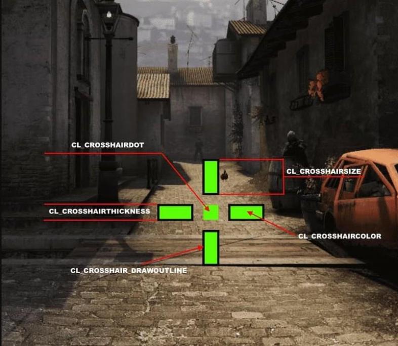
Having a perfect crosshair that contrasts with all backgrounds in CS:GO and one that you can see effortlessly is very important. What’s the point of spending countless hours in practice and setting optimizations and countless dollars in the best gear when at the end of the day, you can’t even see your own crosshair? Here I have for you the near-perfect crosshair. You can update the elements in it as per your taste.
- Go to Game Settings at the bottom of the icons at the left.
- Go to Game; it’s the fourth option on the top
- Make the following changes to the options under Crosshair:
Crosshair style: Classic static
Center dot: No
Length: 2.5
Thickness: 0.5
Gap: 0.0
Outline: Enabled – 1.0
Red: 0
Green: 255
Blue: 0
Alpha: 255
T-style: Yes
Deployed weapon gap: No
Show player crosshairs: Everyone
9. Radar Settings
Believe it or not, radar is actually a very vital part of a CS:GO game. All good players use the radar. If you haven’t cried out loud about how broken the default radar is at least once in your playtime, then I have one word for you: Silver. Jokes apart, let’s see how you can upgrade your radar to be a perfect competitive tool.
Here are the best radar settings:
- Type this in your config:
cl_radar_always_centered “0”
cl_radar_scale “0.3”
cl_hud_radar_scale “1.15”
cl_radar_icon_scale_min “1”
cl_radar_rotate “1”
cl_radar_square_with_scoreboard “1”
This will help you see more of the radar, hence naturally helping you overall. But sometimes, you do need to zoom in to see where the bomb is (if it’s hiding in the smoke). So here’s a simple bind to switch between zoomed-out and zoomed-in. Adjust it according to your chosen values. These are just basic examples.
- Type this in your config: Bind "v" "toggle cl_radar_scale 1.0 0.3"
8. Viewmodel Settings
Viewmodel is simply the hand of your character and the gun it holds. Though almost all of the viewmodels look almost identical, there are indeed variations. A lower viewmodel gives you a better and more view of the field, so it is has a teensy-weensy advantage.
Here are the best viewmodel settings:
- Type this in your config: viewmodel_offset_x 2.5; viewmodel_offset_y -2; viewmodel_offset_z -2; viewmodel_fov 54
Here’s an article for you that will show you the viewmodels of the best pros, along with the codes that you can type in your config: [Top 10] CSGO Best Viewmodel Settings Used by Pros
7. HUD Scale
This defines the HUD Size.
Since a lower value gives you more view of the field, it’s advisable to scale the value down.
I recommend a value of 0.7 or 0.6.
- Go to Game Settings at the bottom of the icons at the left
- Go to the HUD tab
- The second option from the top is HUD Scale that you can adjust
Alternatively, you can type this in your console:
hud_scaling 0.7
OR
hud_scaling 0.6
6. HUD Color
Is there anything more cosmetic than this option? Skins, of course. Who are we kidding? Anyway, I’ll just tell you your options and you can have your pick since the color of your HUD doesn’t really matter much.
Options: Default, White, Light Blue, Blue, Purple, Red, Orange, Yellow, Green, Aqua, and Classic.
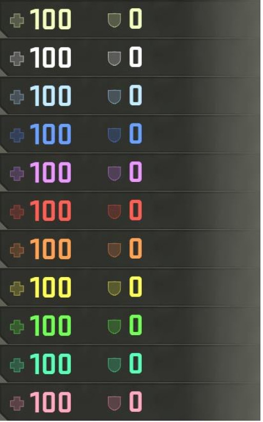
That’s in respective order if you are too colorblind to realize that.
- Go to Game Settings at the bottom of the icons at the left
- Go to the HUD tab
- The third option from the top is HUD Color that you can adjust as per your taste
Alternatively, you can paste this in your console:
cl_hud_color X
Replace X with: 0 = Default, 1 = White, 2 = Light Blue, 3 = Dark Blue, 4 = Purple, 5 = Red, 6 = Orange, 7 = Yellow, 8 = Green, 9 = Aquamarine, 10 = Pink
5. HUD Background Alpha
This determines the transparency/opaqueness of your HUD. I recommend a fairly translucent HUD. If you have enough s1mple/kennyS in you to flick the heck out of a hidden enemy you see through your translucent HUD, congratulations. You have achieved CS:GO. Well, a value of 0.5 is perfect.
- Go to Game Settings at the bottom of the icons at the left
- Go to the HUD tab
- The fourth option from the top is HUD Background Alpha that you can adjust
4. Health/Ammo Style
You can either keep this default style:
Or you can choose to go for this better style:
Doesn’t make much of a difference at the end of the day, but if you can improve it for free, why not do it?
- Go to Game Settings at the bottom of the icons at the left
- Go to the HUD tab
- The fifth option from the top is Health/Ammo Style that you can adjust
3. Bomb Hud Position
You can choose where the bomb will be displayed. Don’t expect a bomb to be displayed if you don’t have a bomb. Thank you.
You can choose to display it under the radar, or amongst the other items in your inventory. I recommend you to have it display under the radar.
The Bad One: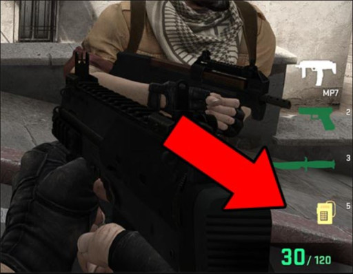
The Better One: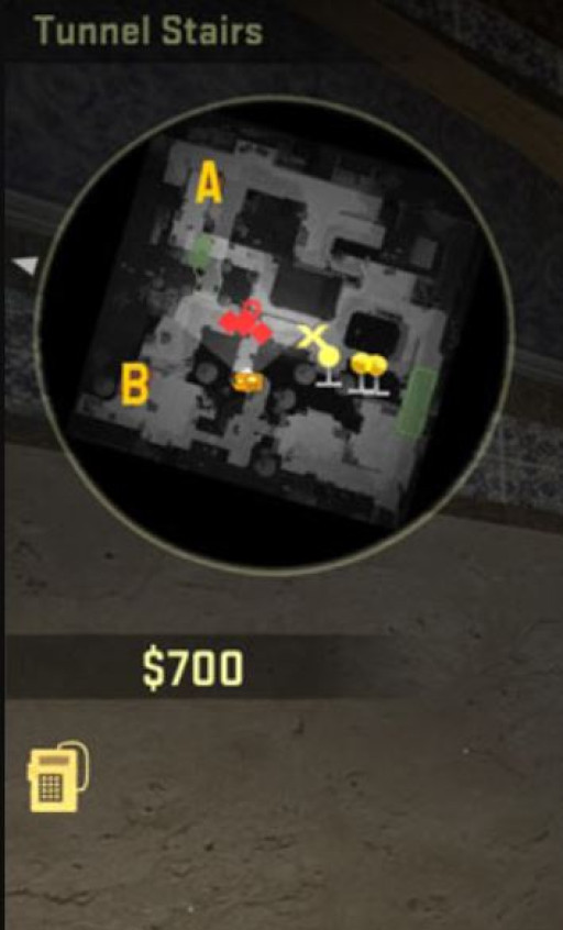
- Go to Game Settings at the bottom of the icons at the left
- Go to the HUD tab
- The sixth option from the top is Bomb Hud Position that you can adjust
2. Mini-Scoreboard Position
You can choose where your mini-scoreboard goes. (which is at the top by default)
You can choose to do something wacky like this: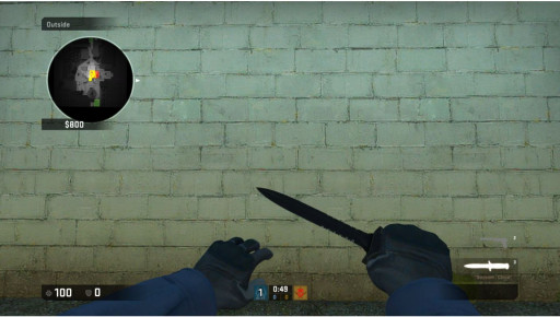
- Go to Game Settings at the bottom of the icons at the left
- Go to the HUD tab
- The seventh option from the top is Mini-Scoreboard Position that you can adjust
Alternatively, you can paste this in your console:
cl_hud_playercount_pos 1
OR
cl_hud_playercount_pos 0
0 or 1, as per your taste.
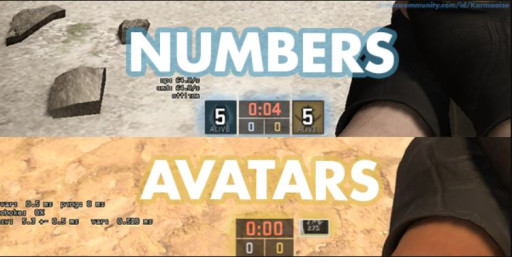
1. Mini-Scoreboard Style
Having avatars of dead people being shown is redundant. Heck, even showing avatars at all is useless. The crucial information that we need is the number of people that are alive on both the enemy and your own sides. I recommend you get rid of avatars and use numbers instead.
- Go to Game Settings at the bottom of the icons at the left
- Go to the HUD tab
- The eighth option from the top is Mini-Scoreboard Style that you can adjust
Alternatively, you can paste this in your console:
cl_hud_playercount_showcount 1
‘1’ will display the numbers – replace it with ‘0’ and you’ll get back the avatars.
You may also be interested in:
- [Top 10] CSGO Best Weapons Used By Pros
- [Top 10] CSGO Deagle Skins That Look Freakin Awesome!
- CSGO Best FPS Settings That Give You An Advantage
- CSGO Best Video Settings That Give You An Advantage
- CSGO Best HUD Settings That Give You An Advantage
- [Top 10] CSGO Best eDPI (Used By The Best Players In The World)
- [Top 10] CSGO Best AWP Players In The World Right Now
- [Top 15] CSGO Best AWP Skins That Look Freakin Awesome!
- Top 15 CS:GO Best Cheap Skins
- Top 10 CS:GO Best Knife Animations
- [Top 10] CSGO Best Knife Skins That Are Freakin Awesome!
- The Best CS:GO Tips - How to Become a Killing Spree Machine
- [Top 10] CS:GO Twitch Streamers
- The 10 Best Riflers In CS:GO
- [Top 15] CSGO Best Aimers

