Which HUD will improve my performance most in TF2?
Custom HUDs are an important part of TF2, most pros use one, and for most of the game’s life people have been hotly debating which one is best. These are generally agreed upon to be some of the best, however it’s up to you to decide which one suits you best and gives you that slight edge over everyone else.
5. ToonHUD
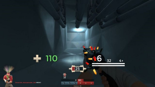
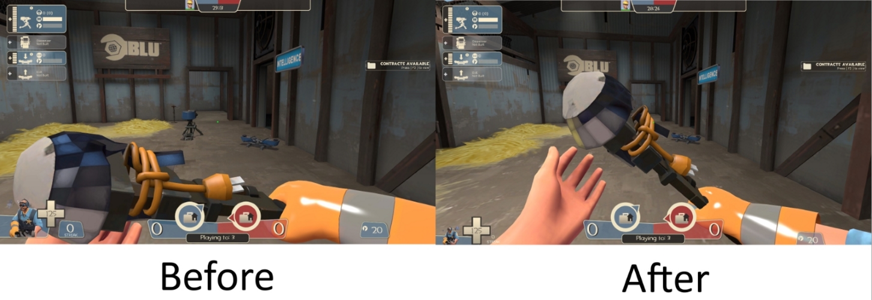
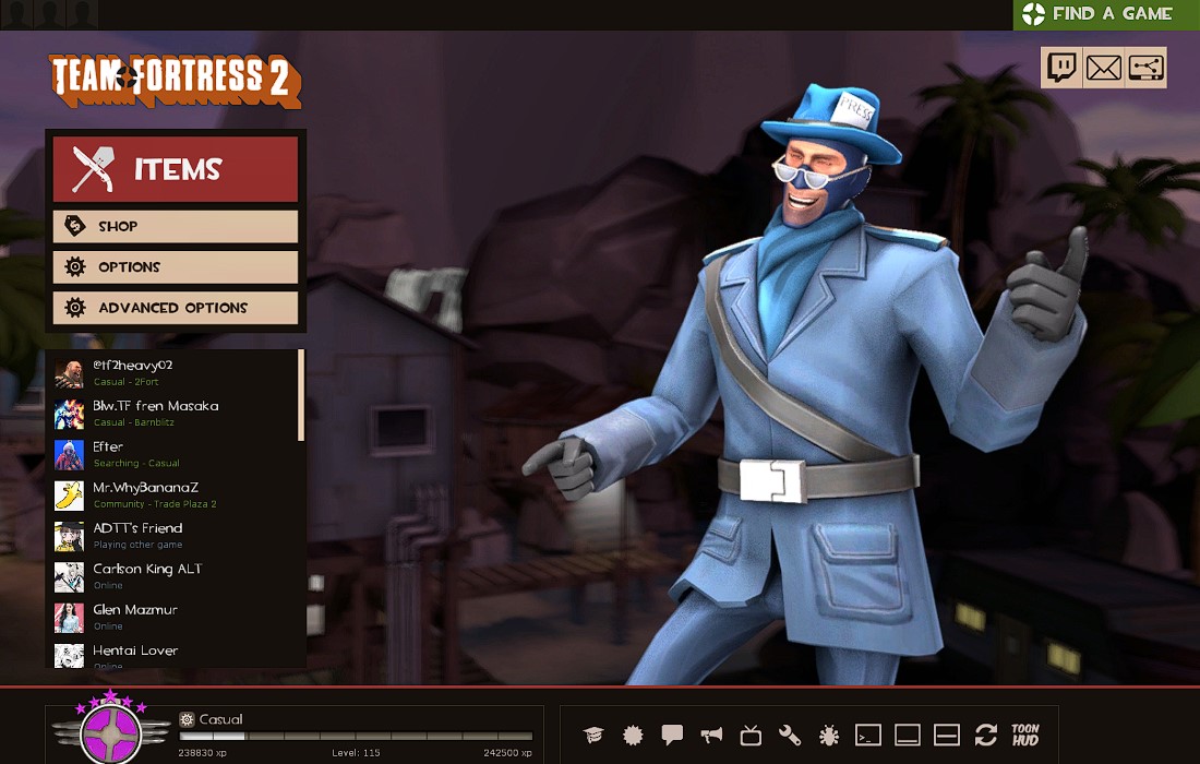
ToonHUD isn’t really its own HUD, as much as it is a tool for generating them, but most HUDs follow a similar layout, and usually when you ask around for the best HUD people will just say ToonHUD rather than a specific theme. If you’re watching a TF2 video it’s also very likely you’ll see ToonHUD.
Why ToonHUD Is Great:
- Minimalist
- Customizable
- Extra features
- Usually moves elements to the center
4.rayshud
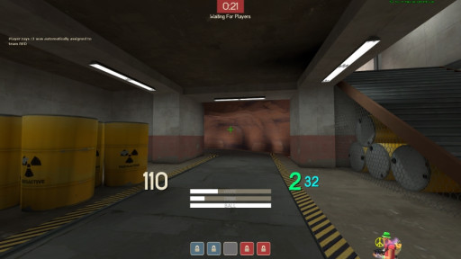
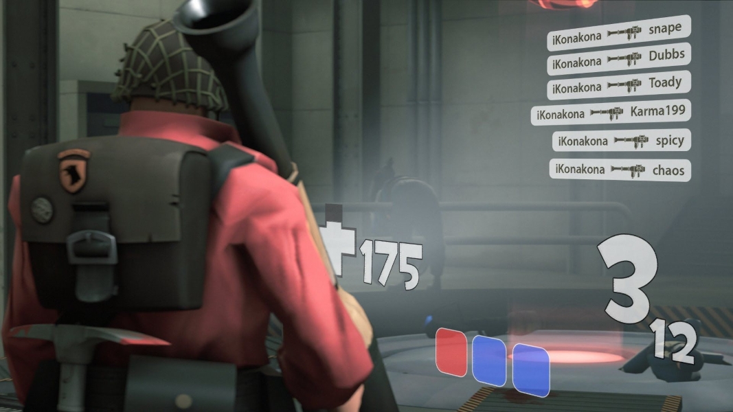
Rayshud is a minimalist hud, presumably made by Ray, which is described on its own download page as “made to cut out a lot of clutter included in that of the stock hud”. This HUD moves things toward the middle of the screen and adds meters that are not available by default, and on top of that changes the color of your health and ammo depending on how low or high they are, so you don’t actually have to look at them to know when you’re in danger.
Why rayshud Is Great:
- Minimalist
- Extra Features
- Easy to tell health and ammo without fully looking at them
- Moves elements to the center of the screen
- Customizable
3.ahud
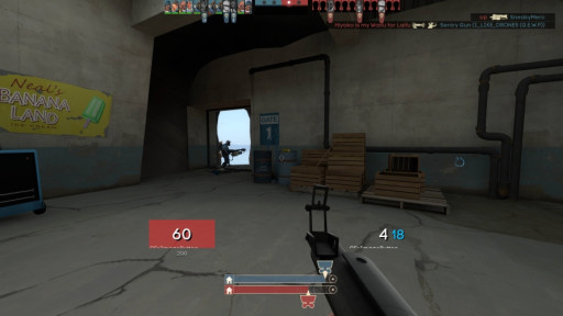
Ahud is a hud. to be more specific, it is a simplistic hud that actually takes inspiration from rayshud. One major difference with this HUD is that instead of changing the color of the text when your health is high or low, it adds a much more noticeable box around your health.
Why ahud is great:
- Moves elements to the center of the screen
- Minimalist
- Easy to tell health and ammo without fully looking at them
- Customizable
2.Budhud
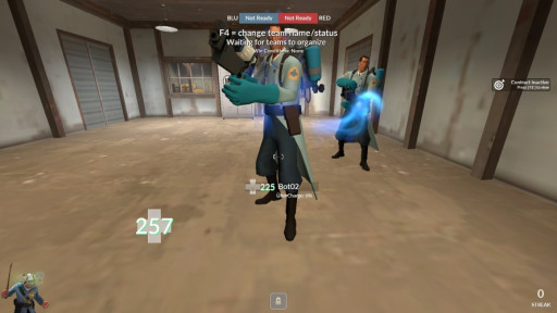
Budhud is a HUD that takes inspiration from the previous two, opting to move important elements to the center while leaving the less important ones out of the way. It also opts to leave the colors on your health as a subtle shadow, which keeps things looking a lot cleaner.
Why budhud is great:
- Moves elements to the center of the screen
- Customizable
- Easy to tell health and ammo without fully looking at them
- Minimalist
1.Minimal HUD
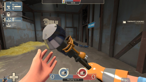
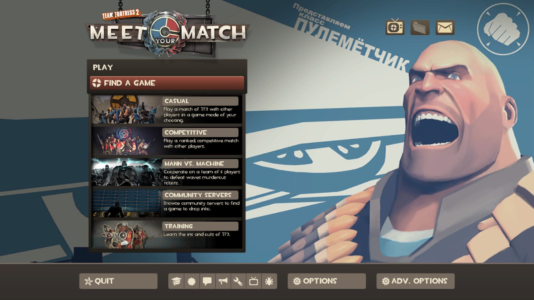
This is my personal preference, and what I’ve been playing with for years. You don’t have to go through the trouble of installing it, it doesn’t clutter up your screen, and best of all, it just works. You don’t really get anything to notify you of your ammo being low, but your health still turns red when it’s low, and you don’t have anything important being moved toward the center of the screen, but nothing can break in an update. At the end of the day, this one is easy and just works.
Why Minimal HUD is great:
- Built into the game
- Minimalist
- Easy to tell health without fully looking at it
- Reliable
You may also be interested in:
Team Fortress 2 Best HUDs (2020 Edition)
Team Fortress 2 Best Crates To Unbox [Top 5]
25 Best Team Fortress 2 Settings That Give You An Advantage
Team Fortress 2 Best FOV Settings That Give You An Advantage
